Flat White Coffee
Flat White
Coffee
A bold, cheeky rebrand for a local coffee shop


Type
Type
Self-directed concept
Deliverable
Identity, packaging, app, print
Tools
Illustrator, Photoshop, Figma
Overview
The Challenge
Flat White Coffee House is a self-directed rebrand concept for a local coffee shop whose regulars skew young: students, creatives, and anyone who orders their latte with a side of “let me get a picture first.” The goal was a brand that felt as fun to look at as the drinks are to post. I wanted it bold, a little cheeky, and impossible to scroll past.
Flat White Coffee House is a self-directed rebrand concept for a local coffee shop whose regulars skew young: students, creatives, and anyone who orders their latte with a side of Instagram. The goal was a brand that felt as fun to look at as the drinks are to post. I wanted it bold, a little cheeky, and hard to scroll past.
Coffee shops are everywhere, and plenty of them look the same: muted neutrals, a tidy sans serif, maybe a line-drawn bean. That works for some brands, but it doesn’t speak to a younger crowd who choose their café as much for the vibe as for the coffee. The challenge was to build an identity with real personality that could still stretch across a paper cup, a retail bag, and a phone screen without losing its footing.
The Identity
The wordmark is built on a soft, melty display type that looks like steam rising off a fresh pour. Paired with a sturdy sans serif and a punchy colour palette, the identity feels playful and confident without tipping into hard to read.
The Identity
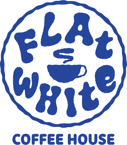
Flat White was designed to feel retro and modern at the same time, and to look great in a photo. The wordmark uses a soft, melty display type with a ’70s feel, its letters wobbling like steam rising off a fresh pour. In the primary logo, it wraps around a circular badge with a small steaming cup at its centre. The secondary logo is an ode to latte art: the wordmark sits inside an irregular, organic circle, as if it’s been poured right on top of a flat white. The brand pattern takes the same steam swirls and mixes in the F and W from Flat White. Scattered together, they create something that reads like a cheetah print: bold, fun, and impossible to miss on a cup or a feed. A sturdy sans serif keeps it all grounded, so the playfulness never tips into hard to read.
Logo Suite


Colour Palette
Sapphire Blue • #26429C
Sapphire Blue • #26429C
Almond Pink • #FCD3CD
Almond Pink • #FCD3CD
Persian Apricot • EB8861
Persian Apricot • EB8861
Brand Pattern

Typography
Synthemesc • Healdine

Proxima Soft • Body and labels


In The Wild


Retail packaging for the house medium-dark roast, with the brand pattern and a cobalt label panel.
Retail packaging for the house medium-dark roast, with the brand pattern and a sapphire label panel over an almond pink background.
Cobalt takeaway cup with the pattern and the badge logo in white.
Sapphire takeaway cup with the pattern and the badge logo in white.
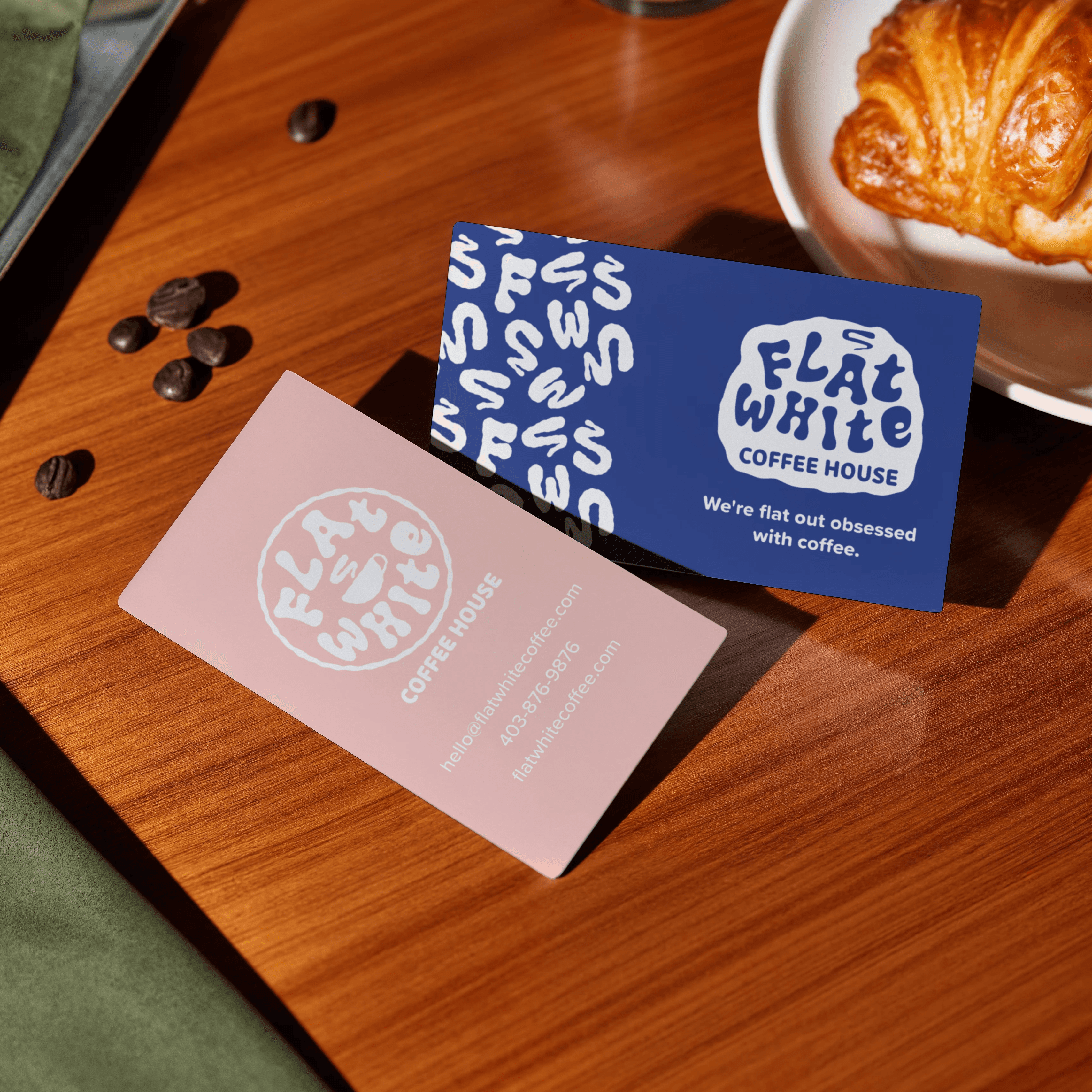
Double-sided business cards in cobalt and blush.
Double-sided business cards in sapphire and almond pink.

The Voice
Flat White doesn’t take itself too seriously, and the copy shows it. A running “flat out” theme ties everything together, from “Flat out delicious” on the cups to “We’re flat out obsessed with coffee” on the business cards. The house roast is called The Main Character (you didn’t come here to blend in), with tasting notes of dark chocolate, dark caramel and a little drama. Even the app gets in on it: made with love, consumed with urgency.
The Brand Voice
The goal for the voice was playful without being too snarky. A lot of brands aimed at a younger crowd lean on sarcasm, but that can feel cold fast and alienate older consumers. Flat White needed to feel fun and approachable while still maintaining the commitment to good coffee.
The other goal was to make it quotable for marketing. Short, punchy lines that stick in your head and are fun enough to repeat or post. The name made that easy. A running “flat out” theme ties everything together, from “Flat out delicious” on the cups to “We’re flat out obsessed with coffee” on the business cards. The house roast, The Main Character, comes with tasting notes of dark chocolate, dark caramel and a little drama, and the app signs off with “Made with love. Consumed with urgency.” Every line is meant to earn a smile and stay with you long after the coffee’s gone.
The App
A mobile ordering screen with a featured seasonal drink, a swipeable “The Usual Suspects” carousel of best-sellers, and a loyalty tracker. The rewards tiers are named Regular, Favourite and Main Character, so working your way up actually feels like a little promotion. A big cobalt “Order Now” button keeps the main action obvious.
The App
The app needed to be easy to use while still feeling unmistakably Flat White, so the design balances clean, simple layouts with pops of colour and personality. The home screen is built around what regulars actually want. A featured menu item sits right at the top (here, an Iced Strawberry Matcha Latte), followed by “The Usual Suspects,” a swipeable row of your previous orders so you can reorder your go-to in a single tap. Loyalty points live right on the home screen, too, with a progress bar showing how close you are to your next free drink, and tiers named Regular, Favourite and Main Character so moving up actually feels like a little promotion. White cards keep everything easy to scan against the blush background, while a big cobalt “Order Now” button makes the main action impossible to miss.
The App
A mobile ordering screen with a featured seasonal drink, a swipeable “The Usual Suspects” carousel of best-sellers, and a loyalty tracker. The rewards tiers are named Regular, Favourite and Main Character, so working your way up actually feels like a little promotion. A big cobalt “Order Now” button keeps the main action obvious.
