Unglazed

Unglazed

A magazine for people who like to throw clay.

Type

Self-directed concept

Deliverable

16-page editorial, masthead, layout, copy

Tools

InDesign

Overview

The Challenge

Unglazed is a 16-page editorial concept for a magazine about pottery, clay culture, and the community around it. Basically, a magazine for people who love to sling clay.
I handled everything: the concept, masthead, colour palette, layouts, typography, and copy.

Craft magazines can lean quiet and earnest, all soft neutrals and gentle serifs. Pottery is messy, tactile, and a little bit wild, and I wanted the magazine to feel that way too. The goal was a bold, modern editorial look with a slightly retro edge, with a cover you’d pick up off the shelf because the colours caught your eye.

The Identity

Chunky display type, a confident orange cover, and asymmetric layouts give the magazine its personality. A consistent grid and type hierarchy keep things readable, so the pages can break the rules without falling apart.

The System

The Grid

A simple grid left room to play. Each feature opens loud on the left, with a full-bleed photo or bold colour block, and settles into calm, tidy columns on the right. Staggered images keep the pages feeling handmade, while consistent margins and the 14 pt baseline hold all 16 pages together.

Page size: 8.5 × 11 in

Columns: 2 per page, 4 across the spread

Column width: 3.625 in

Gutters: 0.25 in

Margins: 0.5 in

Baseline grid: 14 pt

The Cover


The cover had one job: get picked up off the shelf. The chunky masthead runs big across the top so “Unglazed” is the first thing you see, even from across the room. A single strong image does the rest, with no busy collage or crowded cover lines, just one photo that says this is about getting your hands dirty. The bold green ties the cover to the inside of the issue and stands out against the soft, earthy tones most craft magazines use. Cover lines are kept short and few, teasing the main features without competing with the image, so the whole thing reads in about two seconds: what it is, who it’s for, and why you should open it.

A simple grid left room to play. Each feature opens loud on the left, with a full-bleed photo or bold colour block, and settles into calm, tidy columns on the right. Staggered images keep the pages feeling handmade, while consistent margins and the 14 pt baseline hold all 16 pages together.

Page size: 8.5 × 11 in

Columns: 2 per page, 4 across the spread

Column width: 3.625 in

Gutters: 0.25 in

Margins: 0.5 in

Baseline grid: 14 pt

The Cover

The cover had one job: get picked up off the shelf. The chunky masthead runs big across the top so “Unglazed” is the first thing you see, even from across the room. A single strong image does the rest, with no busy collage or crowded cover lines, just one photo that says this is about getting your hands dirty. The bold green ties the cover to the inside of the issue and stands out against the soft, earthy tones most craft magazines use. Cover lines are kept short and few, teasing the main features without competing with the image, so the whole thing reads in about two seconds: what it is, who it’s for, and why you should open it.

The System

The Grid

Page size: 8.5 × 11 in

Columns: 2 per page, 4 across the spread

Column width: 3.625 in

Gutters: 0.25 in

Margins: 0.5 in

Baseline grid: 14 pt

A simple grid left room to play. Each feature opens loud on the left, with a full-bleed photo or bold colour block, and settles into calm, tidy columns on the right. Staggered images keep the pages feeling handmade, while consistent margins and the 14 pt baseline hold all 16 pages together.

The cover had one job: get picked up off the shelf. The chunky masthead runs big across the top so “Unglazed” is the first thing you see, even from across the room. A single strong image does the rest, with no busy collage or crowded cover lines, just one photo that says this is about getting your hands dirty. The bold green ties the cover to the inside of the issue and stands out against the soft, earthy tones most craft magazines use. Cover lines are kept short and few, teasing the main features without competing with the image, so the whole thing reads in about two seconds: what it is, who it’s for, and why you should open it.

The Cover

The System

The cover had one job: get picked up off the shelf. The chunky masthead runs big across the top so “Unglazed” is the first thing you see, even from across the room. A single strong image does the rest, with no busy collage or crowded cover lines, just one photo that says this is about getting your hands dirty. The bold green ties the cover to the inside of the issue and stands out against the soft, earthy tones most craft magazines use. Cover lines are kept short and few, teasing the main features without competing with the image, so the whole thing reads in about two seconds: what it is, who it’s for, and why you should open it.

The Cover

The Grid


Page size: 8.5 × 11 in

Columns: 2 per page, 4 across the spread

Column width: 3.625 in

Gutters: 0.25 in

Margins: 0.5 in

Baseline grid: 14 pt

A simple grid left room to play. Each feature opens loud on the left, with a full-bleed photo or bold colour block, and settles into calm, tidy columns on the right. Staggered images keep the pages feeling handmade, while consistent margins and the 14 pt baseline hold all 16 pages together.

Check out my insides!

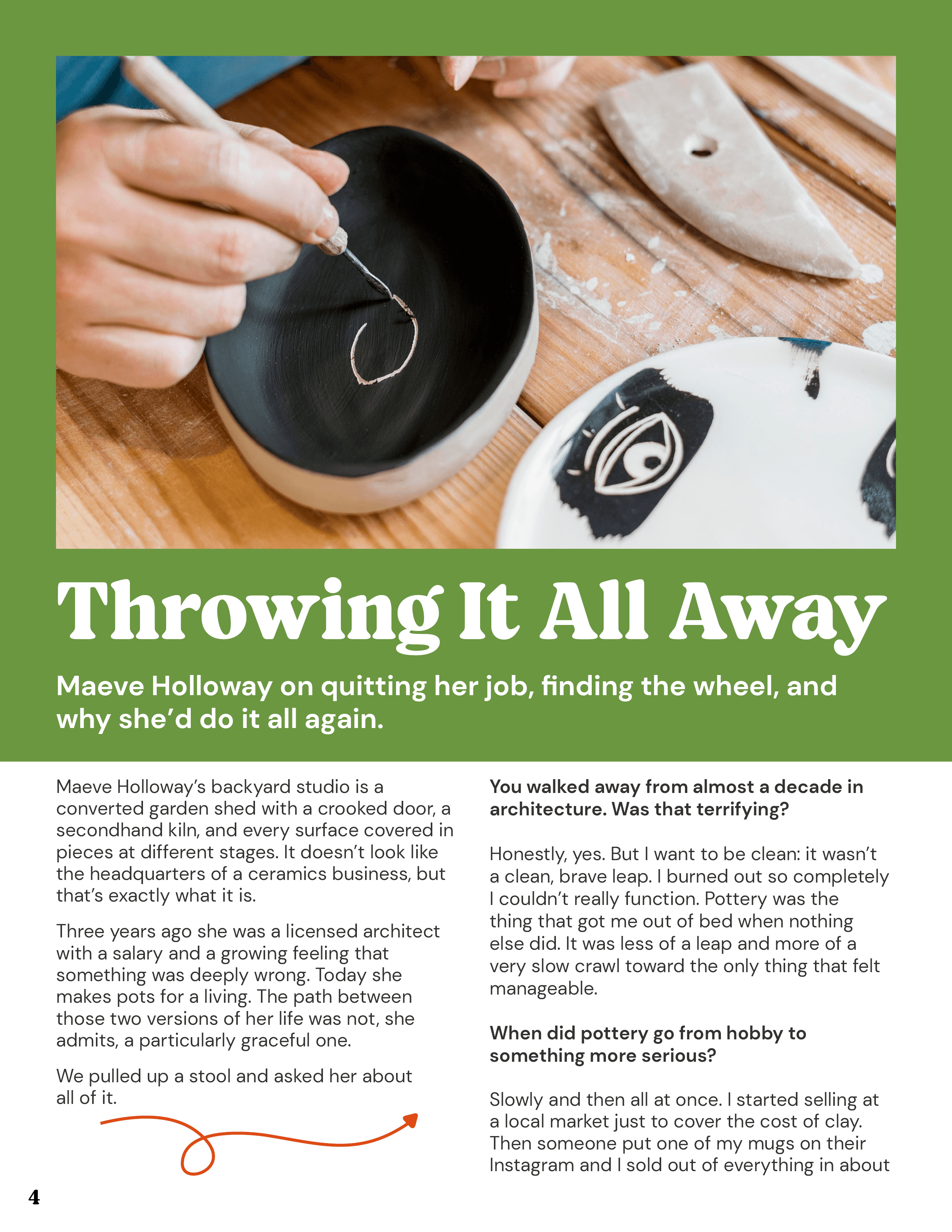
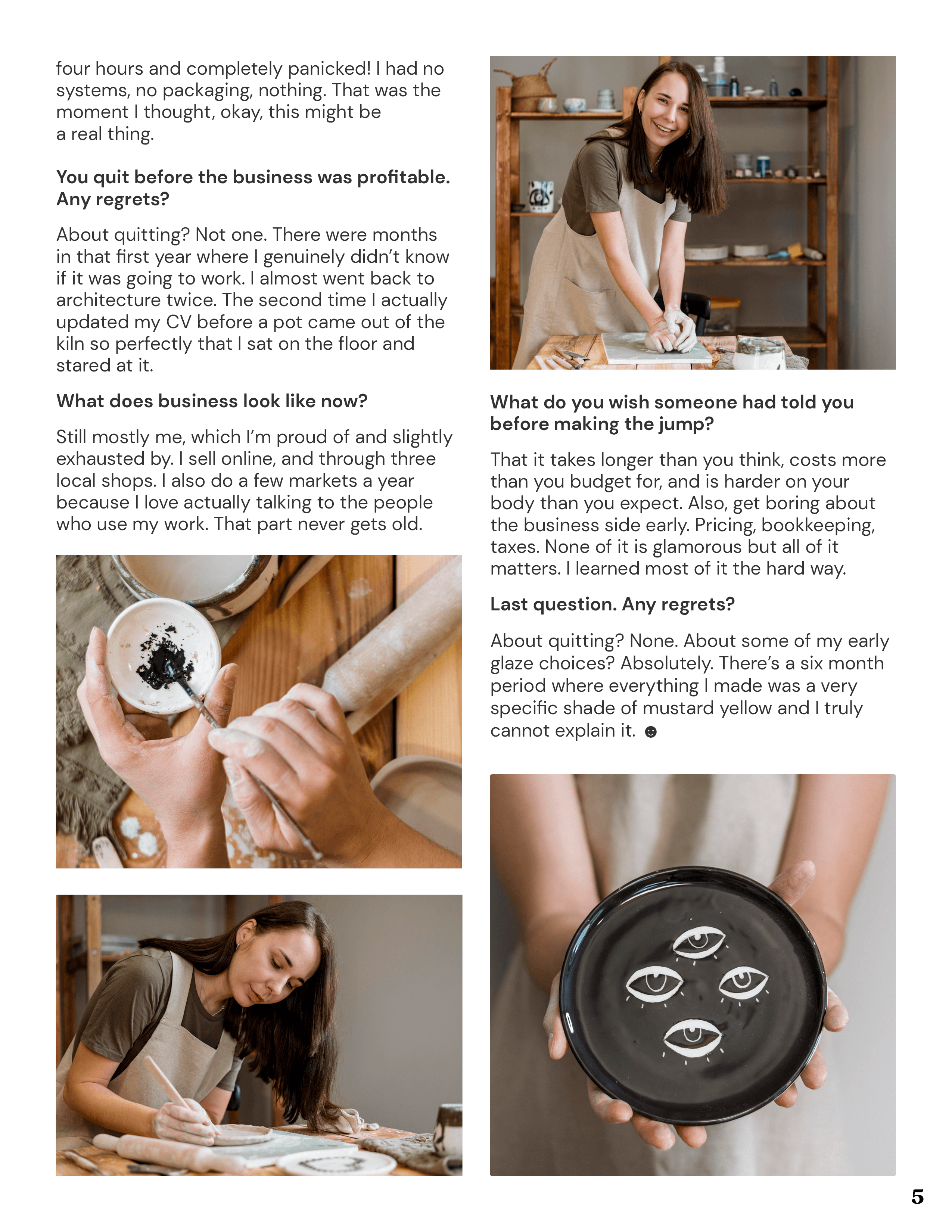
Throwing It All Away (profile)
A Q&A with a former architect turned potter. A bold colour-block opener and a hand-drawn arrow pull you straight into her story.

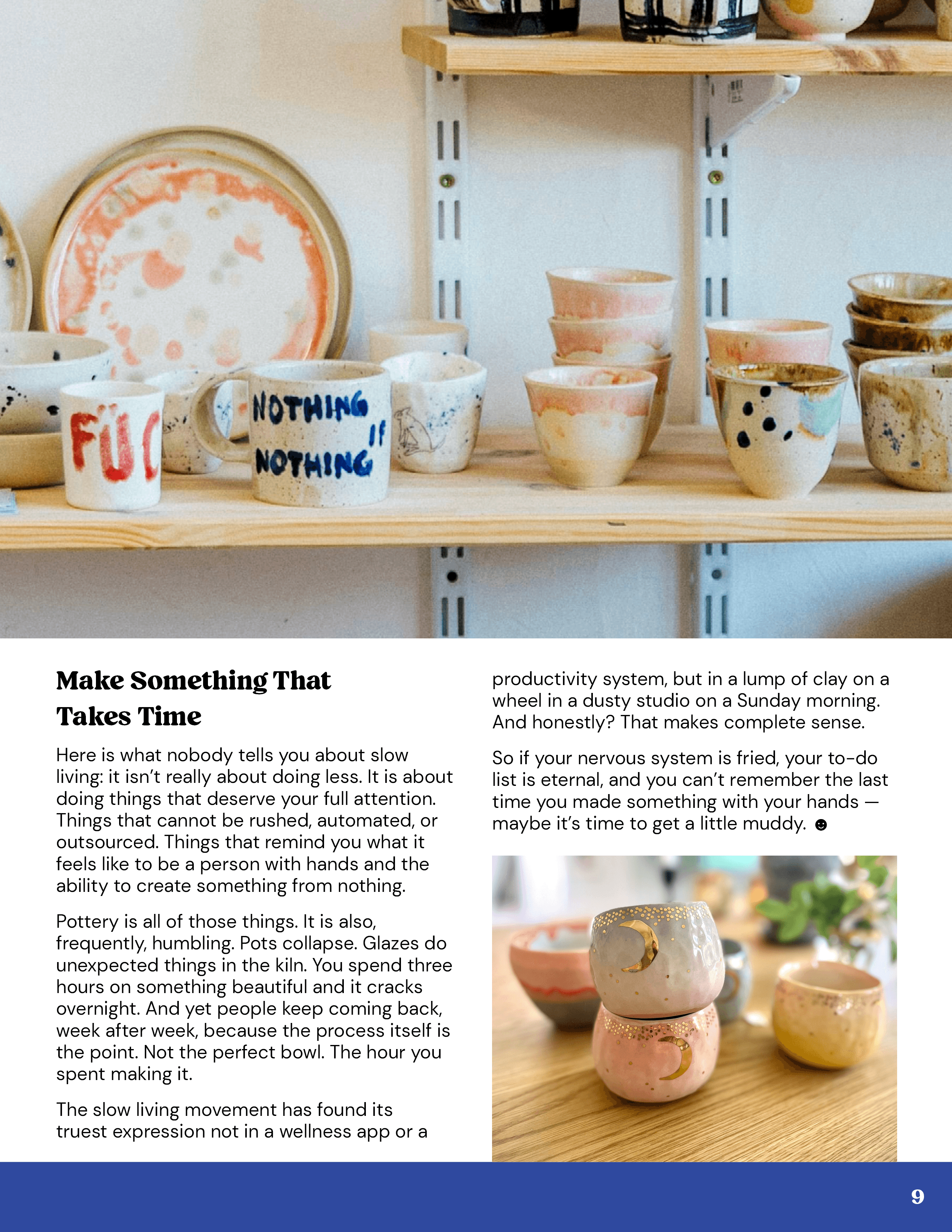
Slow Made (essay)
A full-bleed studio photo carries the headline, while the right page slows down with calm columns, a pull quote and a sliver of mustard at the edge.

The Sunday Studio (photo essay)
A photo essay where the pictures lead and the words stay out of the way.