Greenbriar Market
+ Refillery

Greenbriar Market
+ Refillery

Where sustainability meets luxury.
Role

Lead Graphic Designer, Terra Digital Agency

Deliverables

Deliverables

Brand refresh, signage, packaging, merch, website redesign

Tools

Adobe Illustrator, Adobe Photoshop, Shopify

Overview

The Challenge

Greenbriar Market + Refillery is a locally owned shop for package-free essentials and refillable goods, built on the idea that living lightly doesn’t mean giving up beautiful things. I led a refresh of the brand, carrying it from the logo through store signage, packaging, merch and a brand-new Shopify website.

Greenbriar’s existing identity was already familiar to its community, but it hadn’t kept up with how much the business had grown. The goal was to elevate the brand, not start over: keep what people recognized, and give it the polish to match a shop that had become a destination.

The Identity

Rather than replace a logo the community already knew, I refined it, weaving a greenbrier vine through the G to create a botanical mark that’s distinctive and true to the name. It steers clear of the usual eco-brand clichés (no leaves in circles, no recycling arrows), so the brand feels natural without looking like every other green business. A monochromatic palette of teals and greens, balanced with cool neutrals, gives it a sophisticated, quietly luxurious feel.

Before

After

Logo Suite

Colour Palette
Deep Teal • #004043

Marigold
#F4A800

Ming • 2E696B

Burnt Orange
#C54901

Steel Teal • #65898A

Glacial Water

#018790

Morning Blue • #809E9C

Lake Blue
#9BCBCB

Ash Grey • #B8C4C3

Marigold
#F4A800

Charcoal • #252E2E

Burnt Orange
#C54901

Cultured White • #F7F7F7

Glacial Water

#018790

Rich Black • #0A0A0A

Lake Blue
#9BCBCB

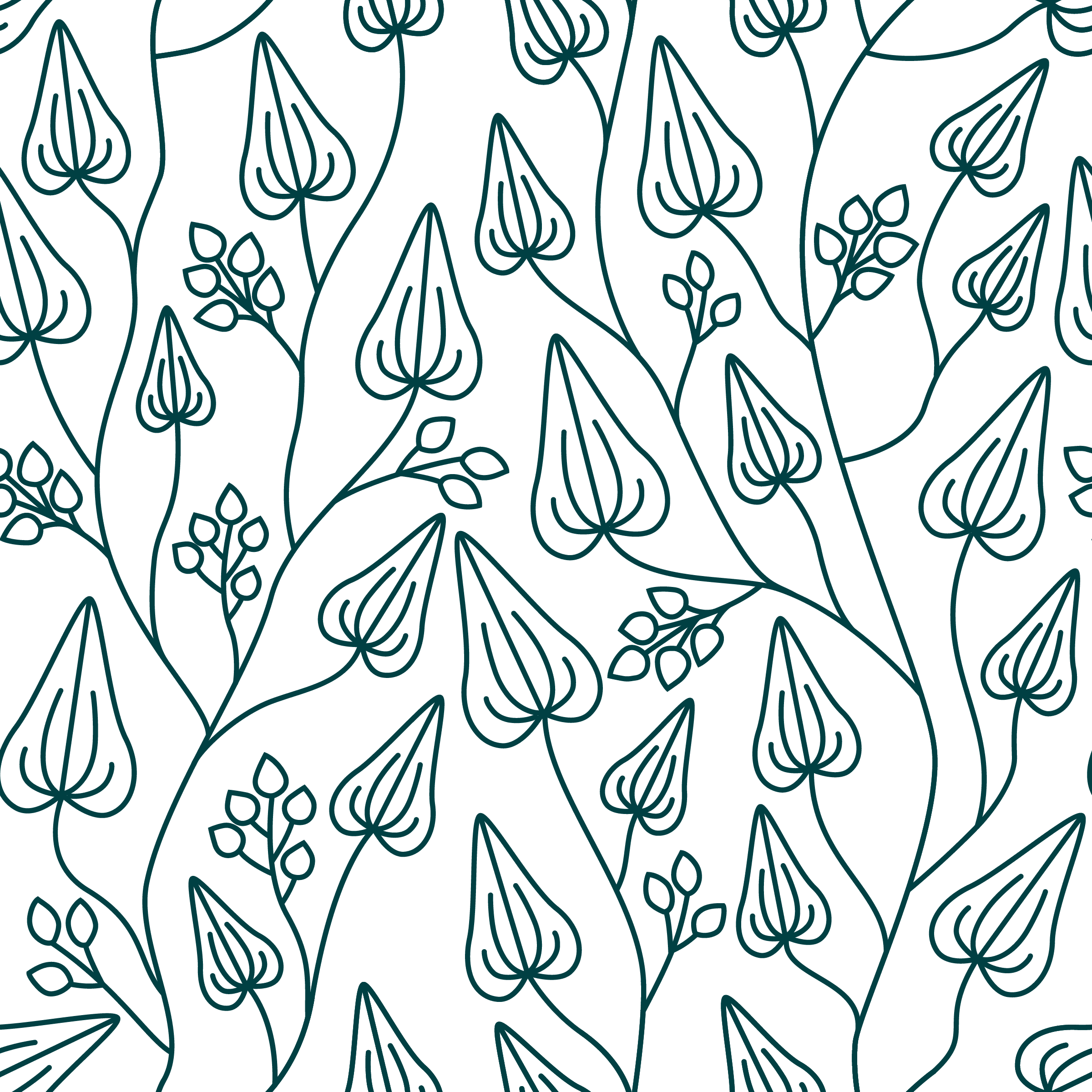
Brand Pattern

Typography

Cormorant SC Bold • Headlines

Isabella Grand Italic • Details and labels

Hind • Body and details

In The Wild

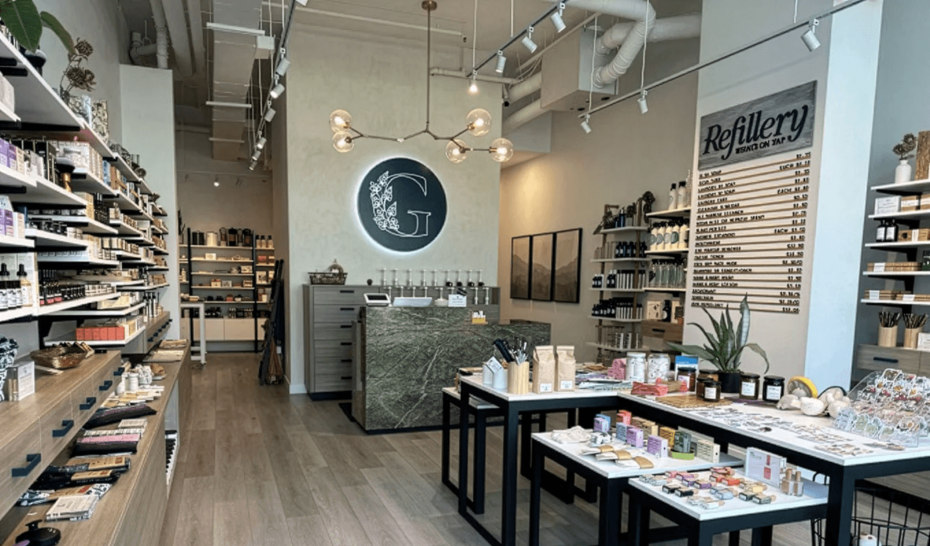
A refresh only works if it shows up everywhere customers actually meet the brand. For Greenbriar, that meant the shop floor, the bags people carry home, and the shirts the team wears behind the counter. Each piece uses the same calm teal palette and vine G mark, so whether you’re walking past the window or unpacking at home, it all feels like one considered, quietly luxurious experience.

Clear, elegant signage helps shoppers find their way around the refill stations, and makes the shop feel as polished as the products on its shelves.

Reusable totes that are as practical as they are pretty, so customers have something worth bringing back for every refill.

Deep teal on the front, a whisper of botanicals
on the back.

The Packaging

Custom tissue paper and recyclable bags turn every purchase into a small unboxing moment, so even a refill feels like a gift.

In The Wild

A refresh only works if it shows up everywhere customers actually meet the brand. For Greenbriar, that meant the shop floor, the bags people carry home, and the shirts the team wears behind the counter. Each piece uses the same calm teal palette and vine G mark, so whether you’re walking past the window or unpacking at home, it all feels like one considered, quietly luxurious experience.

Clear, elegant signage helps shoppers find their way around the refill stations, and makes the shop feel as polished as the products on its shelves.

Reusable totes that are as practical as they are pretty, so customers have something worth bringing back for every refill.

Custom tissue paper and recyclable bags turn every purchase into a small unboxing moment, so even a refill feels like a gift.

Deep teal on the front, a whisper of botanicals
on the back.